
Blueprint
An adaptive whiteboard that helps people plan the way they want.
2024
Application
Overview
Blueprint is a trip planning project my teammate David and I started from scratch. I was in charge of design, David was in charge of the programming. Together, we both thought of the features and strategy.
🎉 Results
From idea to conception, David and I were able to bring Blueprint to life in May 2024. This fun 4-month pivot from whiteboarding to trip planning resulted in an increase from 300 MAU to almost 800 MAU. That’s about a 166% increase in monthly active users since we pivoted in May.
My contributions
Designing the end-to-end experience for mobile and web
Interviewing users, user testing
Defining features

Blueprint started out as a collaborative brainstorming whiteboard that reduced the barrier to entry to collaboration by requiring no sign-ups. However, I found myself using it a lot more for trip planning than brainstorming, so David and I decided to pivot and scope it towards planning.
❌ The problem
Current planning tools force users to follow their rigid, inflexible format.
Users are using tools that aren’t specialized for planning (Google sheets/excel)
Users struggling to format google sheets or excel to fit their itinerary in the way that best suits them; always requiring rearrangement when cells shift.
Hard to plan trips with other people, lower engagement from other trip goers.
✅ The solution
Adapt to various planning styles
Create customizable blocks that automatically organizes user’s itinerary
Infinite whiteboard to fit any plan or brainstorm
Easy collaboration with video, real-time edits, and link sharing
On-the-go plan referencing with mobile experience
Interviews
I did 20 interviews in February. I took note of people’s planning styles, what they liked and what they didn’t like—and also features that they wished they had.
Synthesizing Interviews
After interviews and writing down all my notes, I distilled them as sticky notes in FigJam and grouped what participants said based on themes.
💡 Key Themes
Better Collaboration
Starting from a pre-made template, instead of starting from scratch
Color coding
A better way to move ideas around
Competitive Anaylsis
I test many of our competitors’ product, such as Miro, Clickup, Mural, etc. I created a chart where I wrote down everything I liked and disliked about each product—and things Blueprint could do better.

Miro
Miro’s user interface has too many options, overwhelming potential new users.

ClickUp
Clickup’s interface is too structured, not great for free-form thinking.
Defining features
When I finished grouping all the thoughts and notes from the interview, my next step was to view the user’s planning at a high level journey and figure out the jobs to be done at each step of the way. These steps consisted of → Brainstorming → Planning → Execution. I was able to then narrow down the users’ goals and pain points and shape them into implementable features.
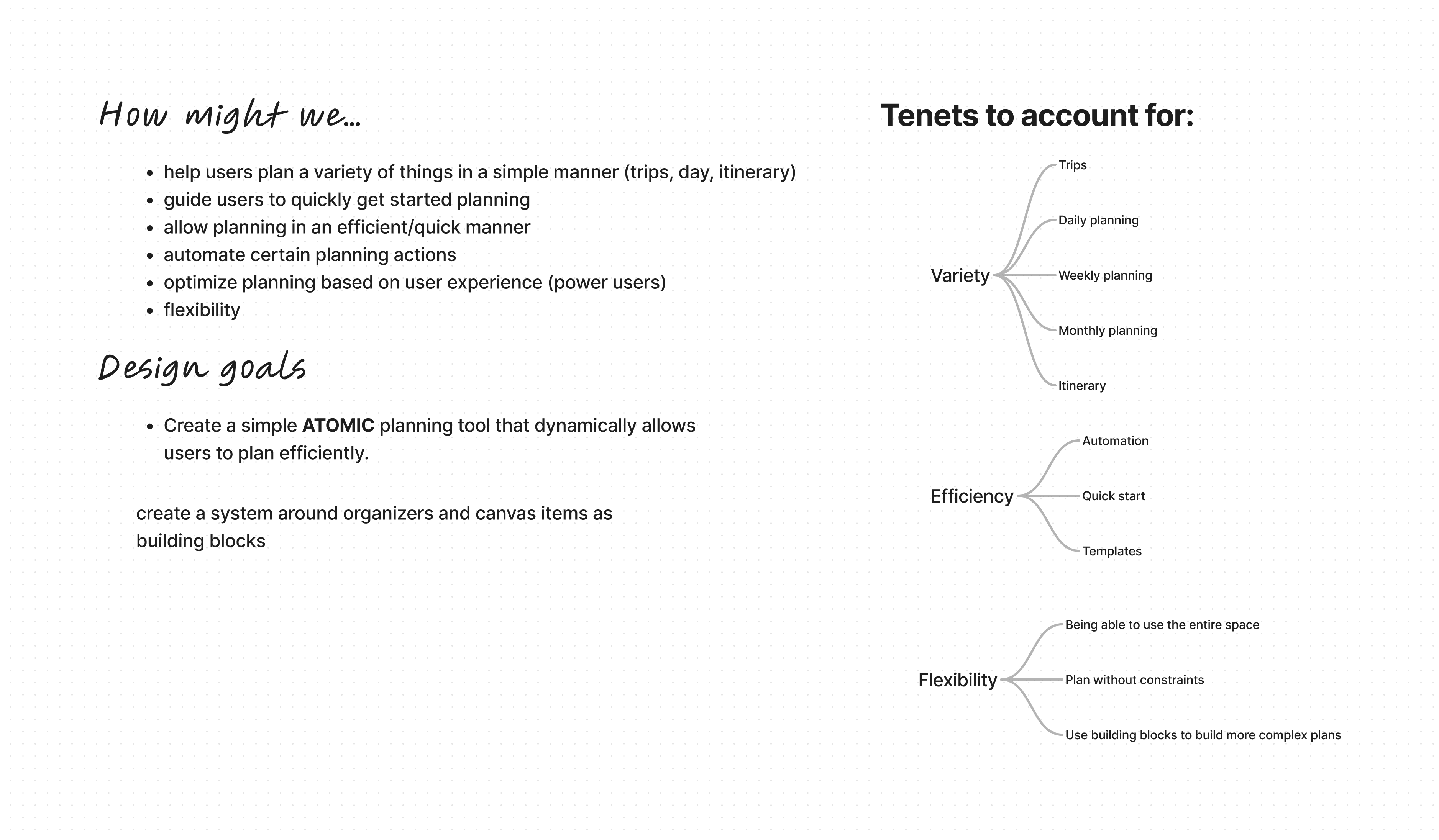
Tenets and Design Goals
1️⃣ Variety
How might we help users plan for a variety of things in a simple manner? Whether that be trips, daily planning, weekly planning, or monthly planning.
2️⃣ Efficiency
How might we guide users to quickly get started planning their trip, what actions can we automate, how can we optimize planning based on skill level (ie. power users).
3️⃣ Flexiblity
What are some ways we can adapt to users’ planning style, how might we allow them to plan without constraints and give them the building block-like tools to build any plan ranging from simple to complex?
Early User flows and wireframes
Before I started designing, I began mapping out interaction flows of different parts of the user journey. Below are images of the ‘Getting started’ flow. The main goal was to get the user started planning as soon as possible with the smallest amount of friction.

Getting started flow
Trying to reduce friction for users getting started, but also setting up users for success without arriving at a blank board.

Low fidelity wireframes
Great for communicating with teammates quickly and coming up with a direction without getting too bogged down on details.
High fidelity mocks
While creating these mocks, David and I met on a regular cadence, (about 4 times a week) to review and get feedback. This would ensure the mocks would go through many rounds of iterations until we landed on something we were both satisfied with.
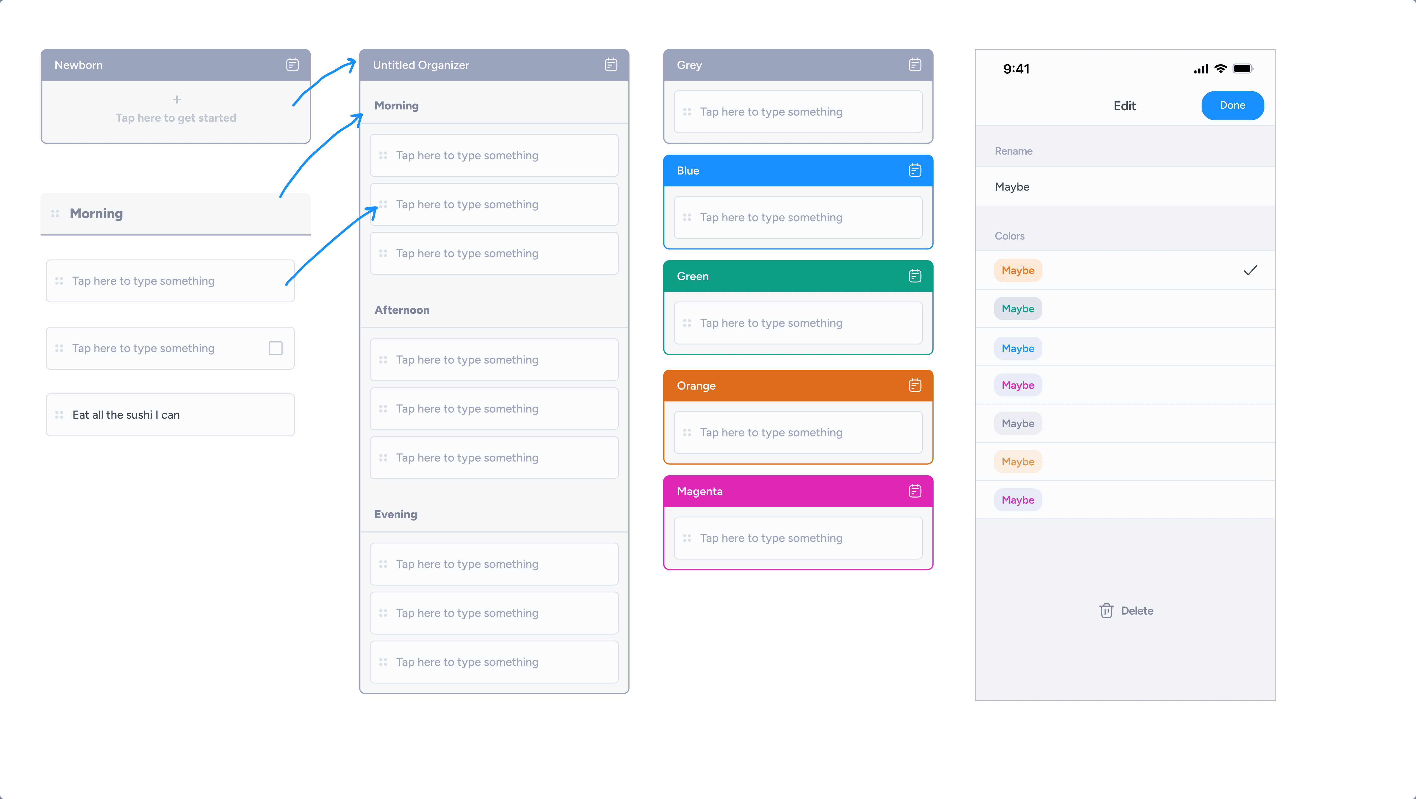
I created 3 types of modular components:
An Organizer: the biggest atomic block, behaves like an organism.
A Header: the second largest, nests into the organizer like a molecule.
A Card: the smallest component, like an atom.

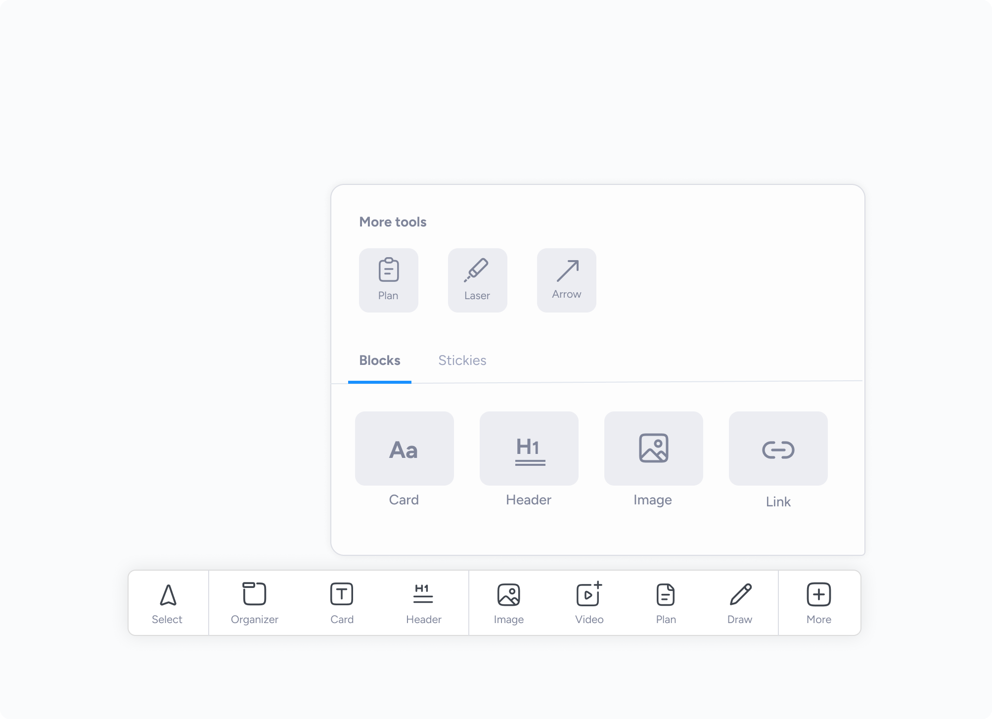
Tool bar
I created a central area where users could easily access their tools. A design and product challenge was deciding which and how many tools to prioritize and which tools would get folded into a "more" section.
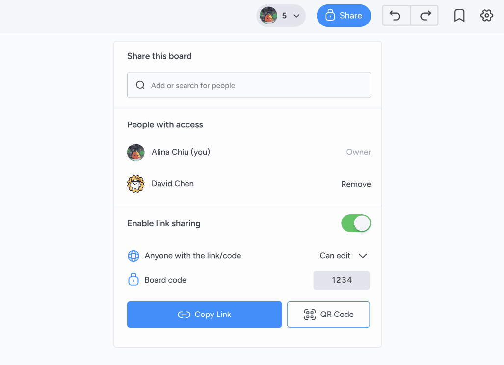
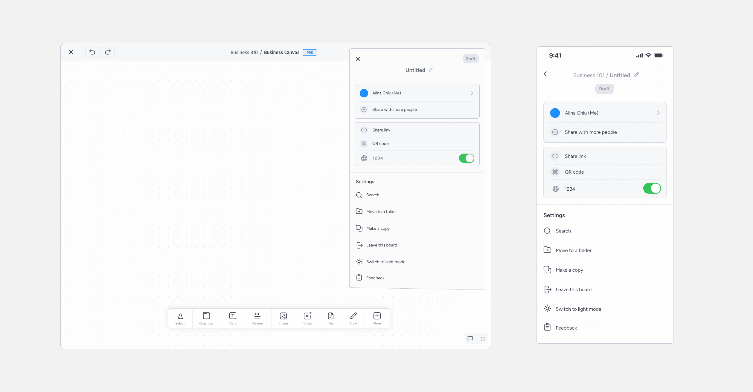
Sharing
One of Blueprint’s value proposition was the ability to share easily. I made sure to include sharing through email, through a link, QR code, and also through a ‘board code’ in this one modal without overwhelming the user while still giving them many sharing options.
Designing for mobile and for web
Making sure both mobile and web were consistent in terms of design was tricky. The difference in interactions and they way users would access each function was even trickier. Here’s an example of how a user might open a menu and their nuances.
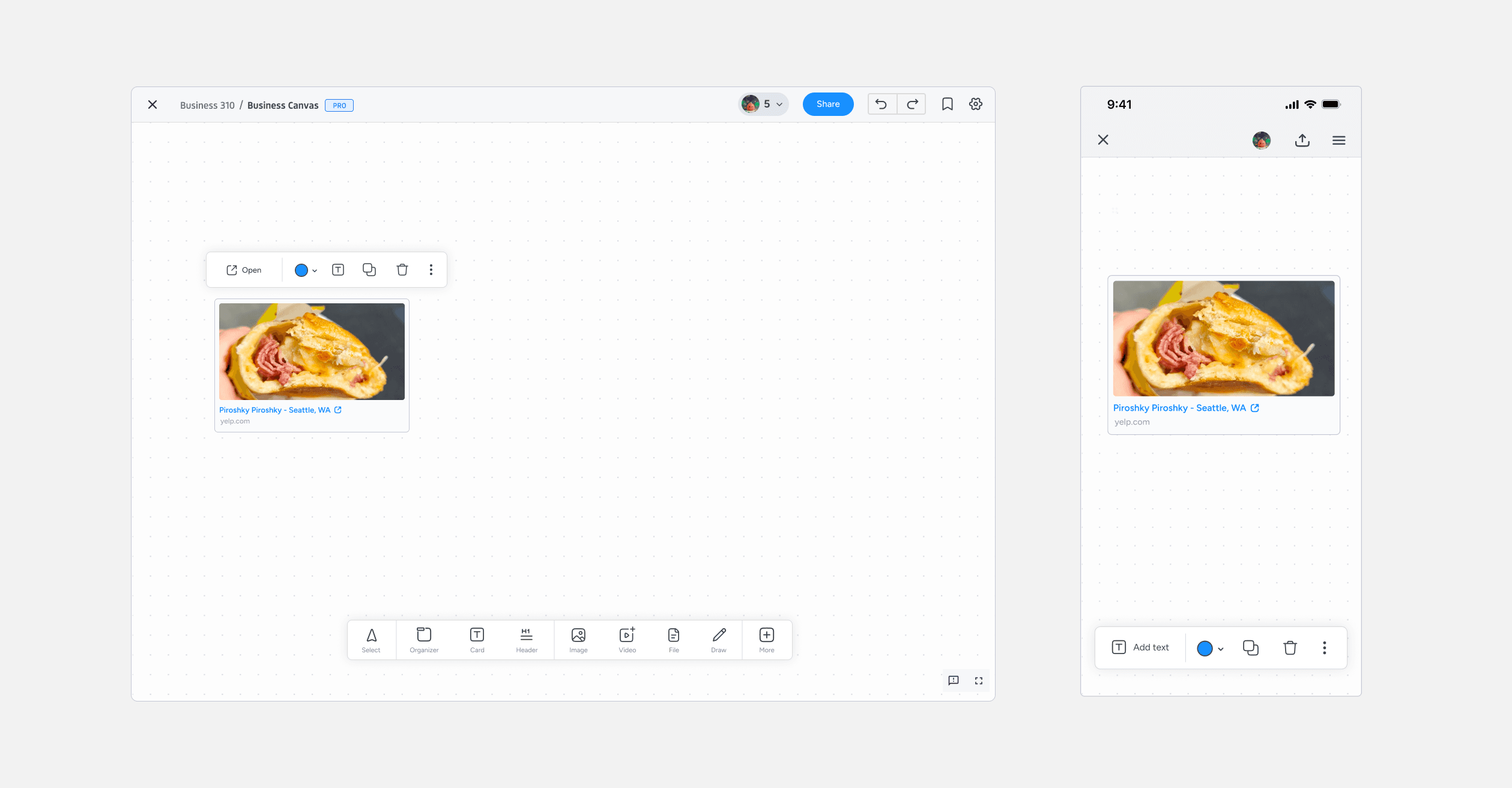
Above is another interesting example of differing interaction models. When selecting an image, the user is presented with actions above the image. When selecting an image on the mobile screen, the toolbar gets replaced with more relevant actions according to what the user last tapped.
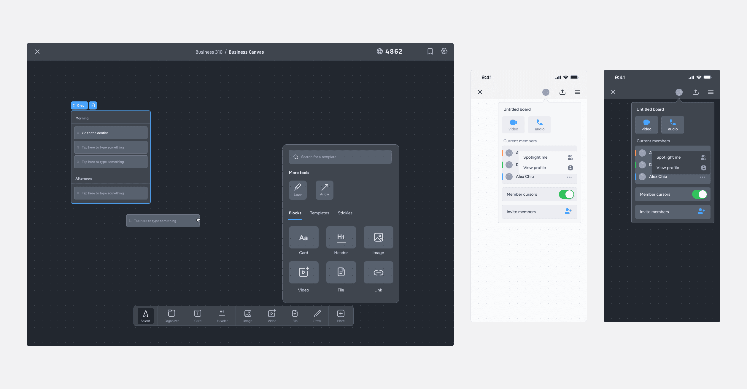
Dark mode themeing
I wanted to have a dark mode theme to go along with the default light mode to help with users that prefer using the darker version and also to go along with system settings.
Quick qualitative studies
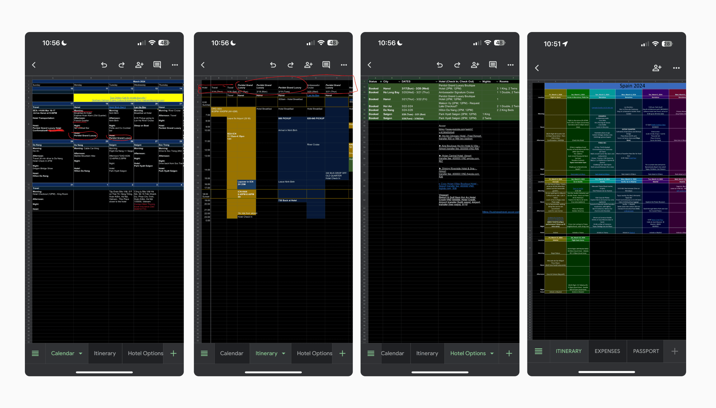
After launching the MVP of the product, it was time to do some more user testing. I had people who were have incorporated some type of planning in their daily lives, or people who are the designated planner for trips to test the MVP. I was able to also get a peak at some interviewee's itineraries that they've created which you'll find below. Note that they are mostly all on Google sheets, a program not built for planning.
Key Objectives
User's reactions to current designs
Do users know how to get started?
Do the modular components match the user's mental model?
💡 Findings
Users stuck on learning best practices
When users arrive on a blank board, they unsure where to start or how components nest within each other.
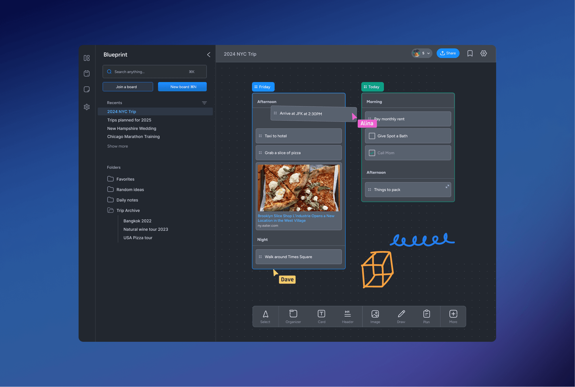
Users want to color code and tag/label
Users reported they wanted to be able to label their cards and see the card's priority and tag at a glance.
When users have many boards, its hard to navigate and find other boards without going back to the home screen.
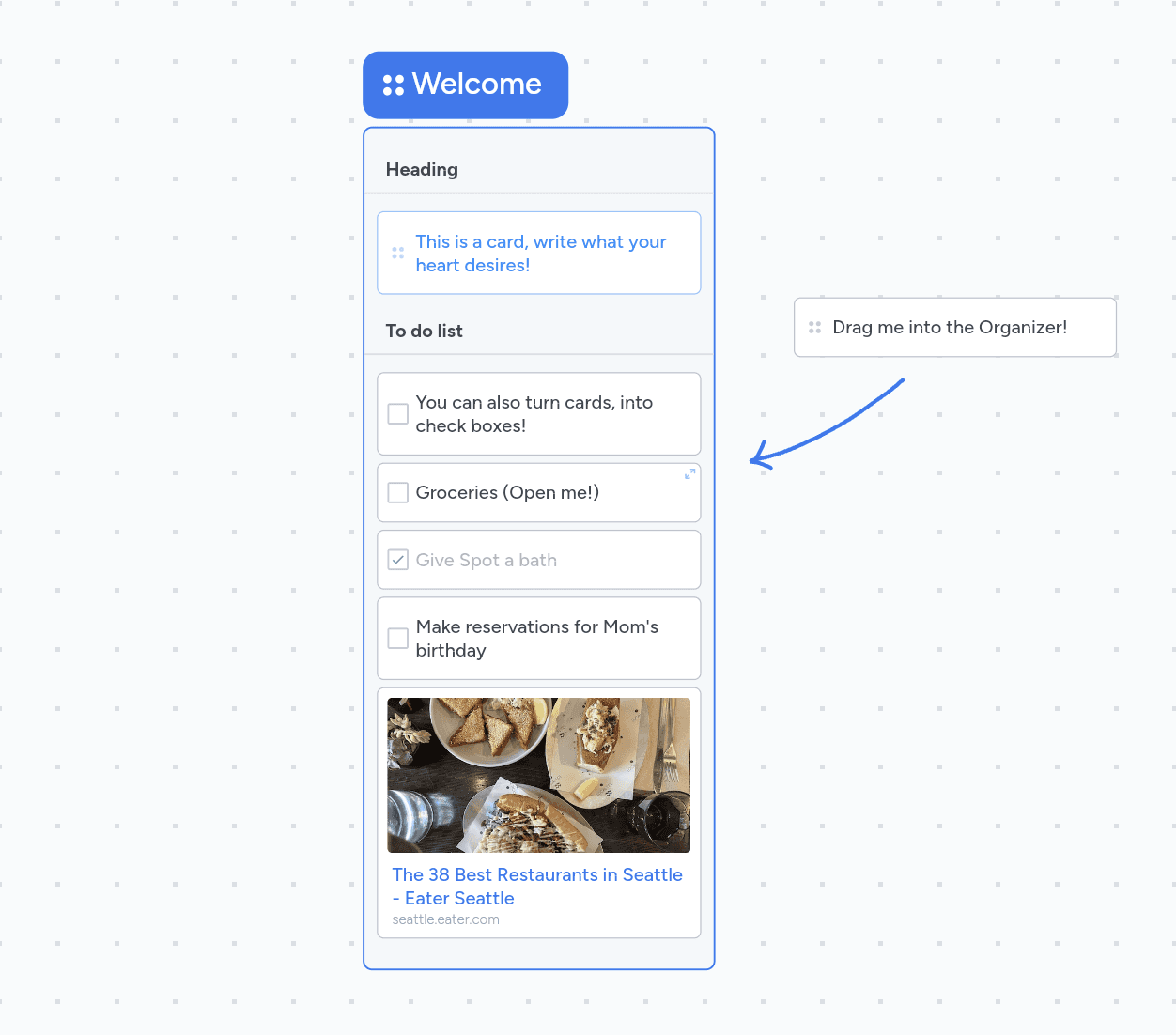
Interactive onboarding
By providing an interactive example, users will be able to get a quick tour of tools, how they interact with each other, and learn best practices by engaging directly with the tools, making it easy to learn and flattening the learning curve.
Improved categorization
By tagging and labeling, users can quickly identify and access specific items without sifting through unrelated content.
This also allows provides better visual clarity, helping users scan and understand their cards at a glance.
Seamless navigation
The side panel allows users to quickly switch between different boards without needing to navigate back to a home page or main menu. This reduces the number of clicks and time needed to move between projects, enhancing overall productivity
Users often need to reference or work on multiple projects simultaneously. The ability to jump between boards via the side panel supports multitasking by allowing users to easily switch context.
Final product walkthrough
This project was a ton of fun to create and happy to see it being in the hands of real users who use it every day. Since launching the new iterative features, we were able to increase the average engagement time from 15 minutes to 23 minutes.